5 tips for choosing the right fonts for your logo
Janine C. Henke, 9 February 2023

5 tips for choosing the right fonts for your logo
In today's highly competitive market, building a brand identity is crucial for the success of your business. It makes your business stand out and gives it credibility. It helps build customer trust and loyalty. And last but not least, it helps your business grow.
Thus, it might be time to rebrand your business if you notice that business is slow.
One of the key elements of brand identity is the logo. After all, this is usually the first thing customers notice. Therefore, learning how to create a business logo is essential. Because it's not all about creativity. For example, certain fonts can convey powerful messages. So, use these five essential tips for choosing the right fonts for your logo.
1. Research basic font types and their characteristics
Learning about the basic font types and their characteristics is one of the top tips for choosing the right fonts for your logo. The main reason is that fonts have specific meanings that customers unconsciously recognize. Moreover, just like colors, fonts can generate specific emotional reactions. To get a better understanding of this, take a look at some of the most common font categories:
● Serif fonts will give your logo a classic, conservative, and elegant feel. They are also associated with tradition and timelessness.
● Sans serif fonts make your logo look modern and minimalist. Technology companies may prefer them due to their simplicity and legibility.
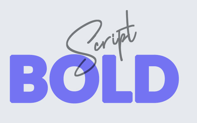
● Script fonts can either make your logo appear feminine and elegant, or casual and retro. It all depends on how much flourish they include.
● Display fonts come in a variety of shapes and forms. That's why they are considered unconventional, fun, and youthful.
2. Match the font with your brand's personality
As previously mentioned, the logo represents a vital part of your brand's identity. Specifically, it reflects its personality.
Think about the message you want your brand to convey and the type of customer relationship you want it to promote. Once you determine these aspects, finding a matching font will be much easier.
For instance, a fun and casual font might not be the right fit if you're creating a moving company logo.
When building a visual identity for your company, you have to take into account your target audience. And most clients are looking for reliability and prestige when picking movers. Thus, a more conservative and elegant font would be a better choice.
3. Don't be afraid to combine fonts
As a general rule, a logo doesn't have to include only one font, but you shouldn't use more than two. Of course, it depends on how much text you want to use. If your logo consists of a symbol and the brand name, you'll need only one font. However, if you also want to add a tagline, you should use a different font.
When combining fonts, don't forget about the visual hierarchy. Customers have to be able to determine which information is more important. So, make sure the brand name stands out from the rest of the text. Now, if you want to include more than just the name and tagline, avoid using a third font. Instead, you can change the size and weight of one of the existing fonts.
At the same time, you should avoid selecting two fonts that have nothing in common. They should include a shared quality even if they are from opposite categories. For instance, they can have similar proportions.
4. One of the top tips for choosing fonts for your logo is - keep it simple
It doesn't matter if the font you choose matches your brand's personality, if people can't read it. That's why simplicity is one of the top characteristics of great logo design. Try to avoid highly embellished fonts. No matter how attractive they may look, they are difficult to read.
Furthermore, to ensure legibility, you should also consider the weight and style of the font. For example, thick and tight fonts are more complex to decipher than thin and spacey ones. However, a thicker font will make the logo stand out if the logo contains a short word.
Make sure you don't get carried away when designing your logo. Too many symbols or text elements will confuse the customer. It's better to keep it simple. This will make it easier for clients to remember your logo and your brand.
5. Choose a scalable font
Scalable fonts are great because you can manipulate their size without deteriorating the quality. This is particularly useful since you should display your logo everywhere, not just on your website. Therefore, it should look good in print as well. For example, you can attach your logo to various merchandise such as mugs, T-shirts, and stationery.
![]()
At the same time, don't forget that mobile optimisation is a must. In this day and age, customers are using their mobile phones much more than their computers. So, if you want to increase your conversions, you should offer your clients the same experience no matter the device they use. In this case, a scalable font will ensure that your logo looks great and is legible even on a tiny screen.
In conclusion
The most important thing to remember is that the logo is a crucial part of your brand's identity. It's what clients see first and are most likely to remember. Therefore, you should put a lot of thought into it. But apart from using your creativity, you'll also have to do a lot of research. These five basic tips for choosing the right fonts for your logo are just the tip of the iceberg. There's a lot more to consider.
Thus, if you don't have the time or skills for this, it might be better to hire professionals. These experts have all the knowledge and experience you need. Just make sure that you collaborate with them throughout the entire process to get the best results.
Author Bio: Janine C. Henke has been working as a content writer for three years. She is passionate about helping young entrepreneurs brand their businesses for success.
In her downtime, she enjoys reading and going hiking.